


5
Jin’s Jams & Jellies

3
Spring Soirée Gala
2
Spring Swing Gala
5
CAI

13
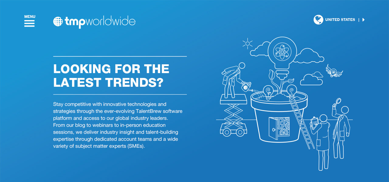
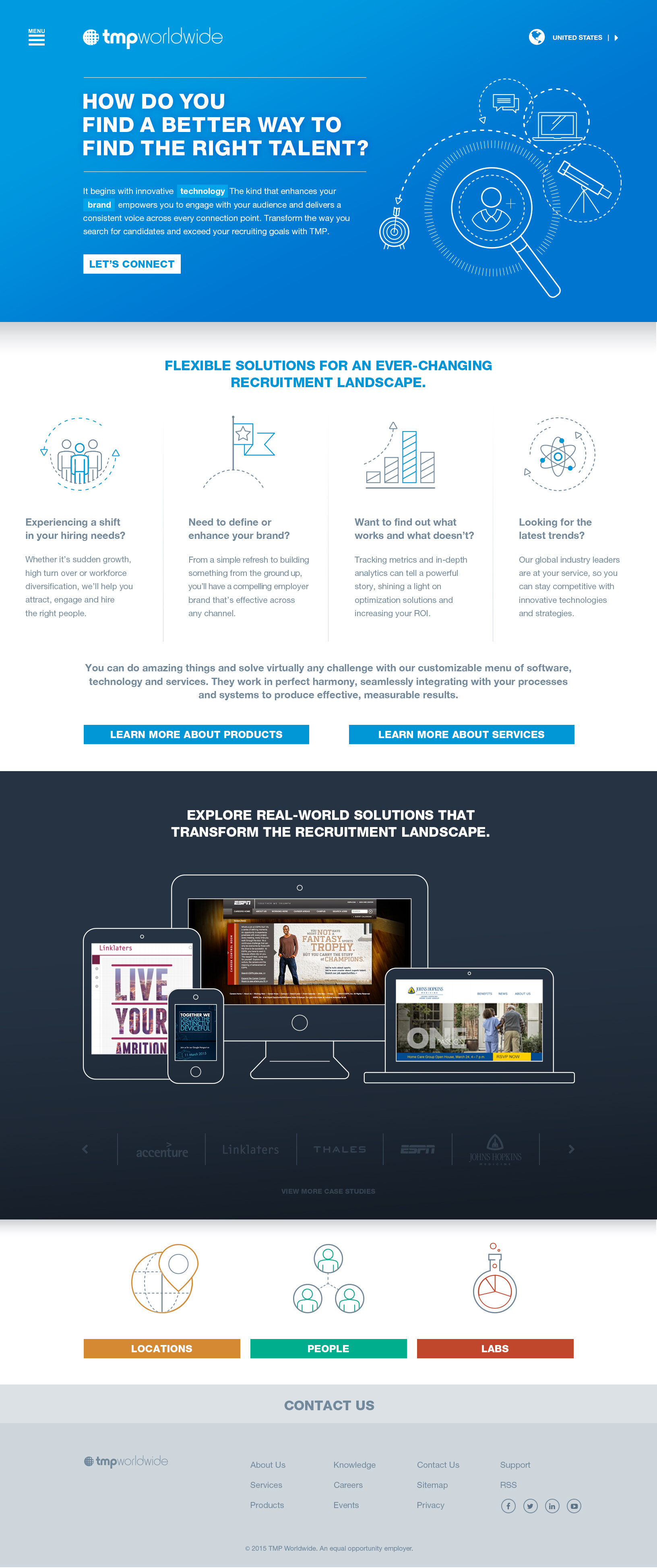
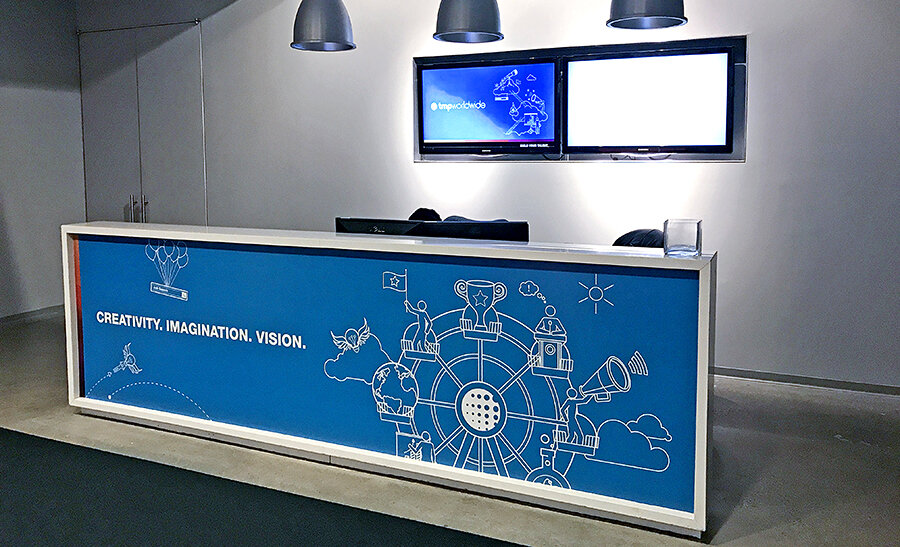
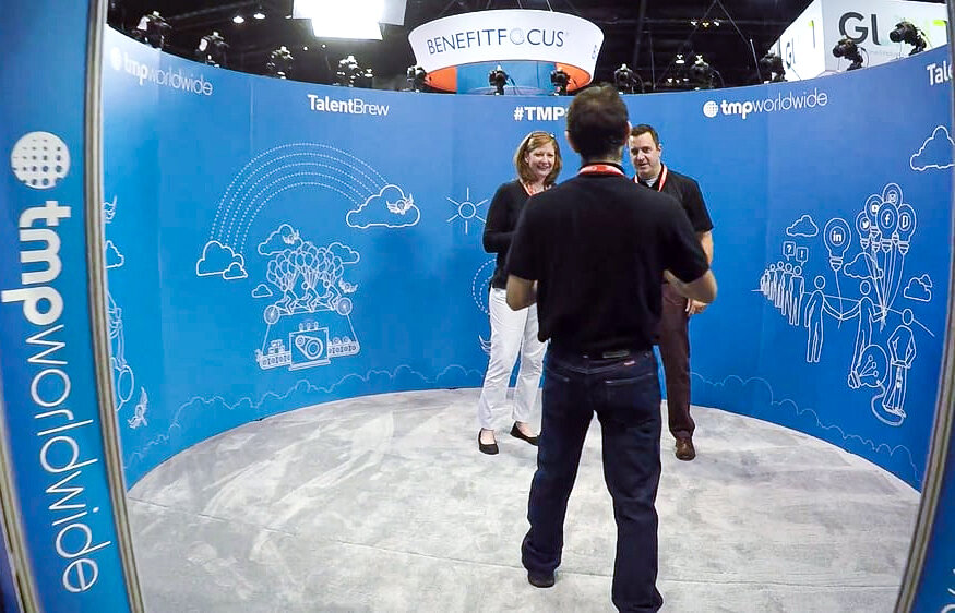
TMP Worldwide Rebrand

5
135th Street Agency

11
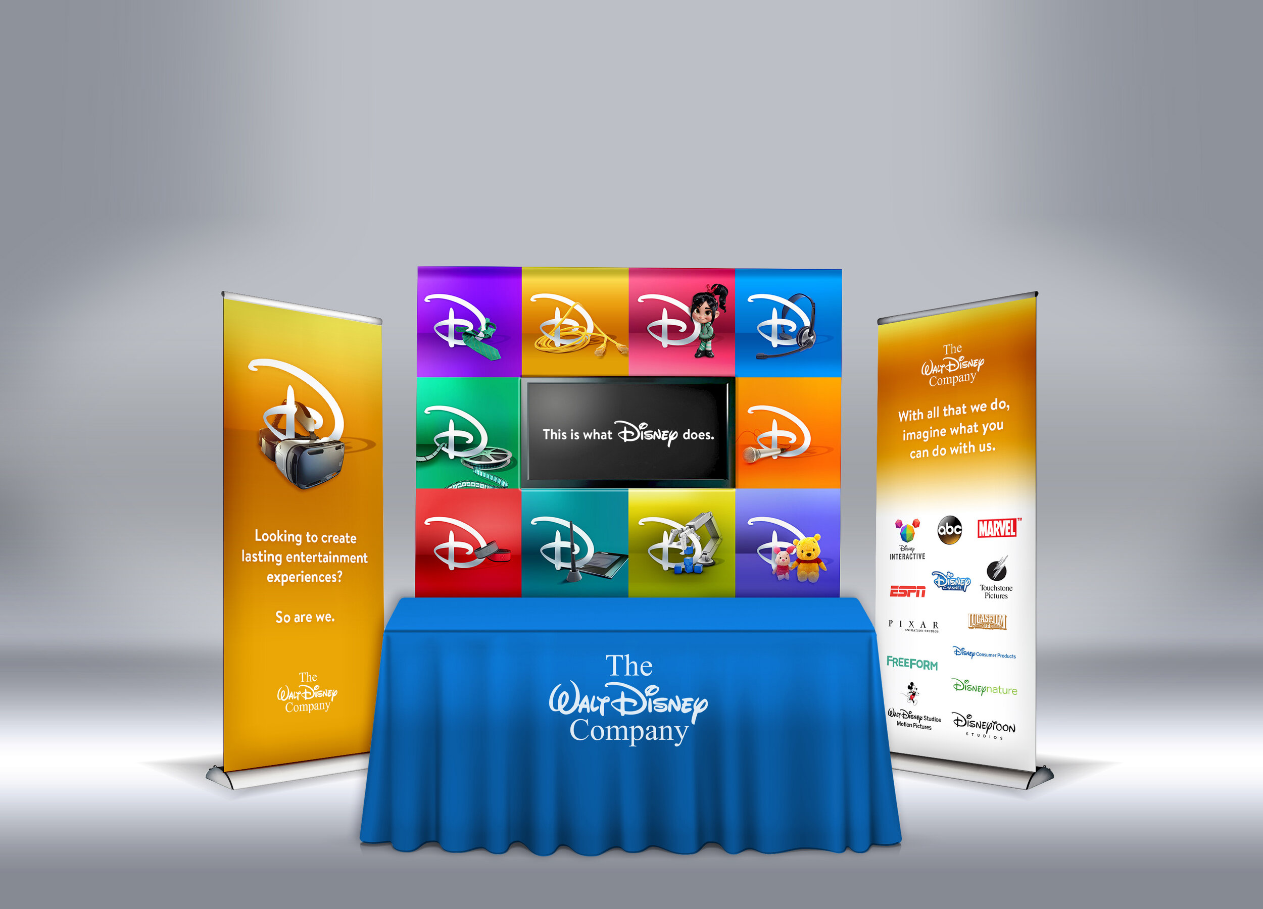
Disney Careers
4
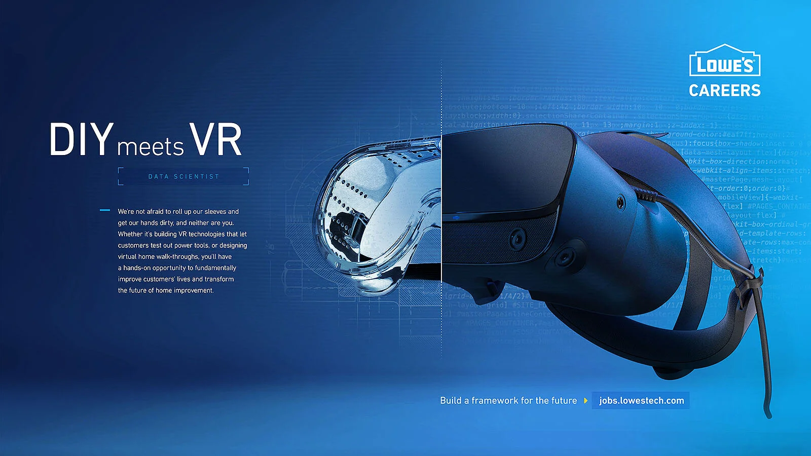
Lowe's Technology Careers
2
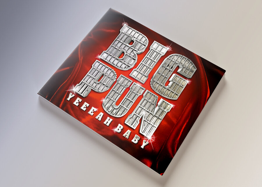
Big Pun - Yeeeah Baby
5
Gertrude’s Paris Festival
6
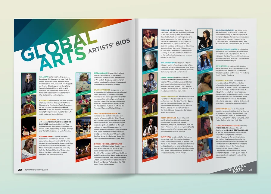
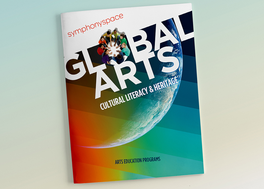
Global Arts

2
dead prez - Let's Get Free
4
MUPD 2013 Annual Report
4
Circulation Nation

6
Planet Muzic

6
Northrop Grumman
3
252 Cigar Lounge
5
Focus on the Future
6
Symphony Space 2011–12 Calendar
7
Wordsworth

4
Harlem Resonance
3
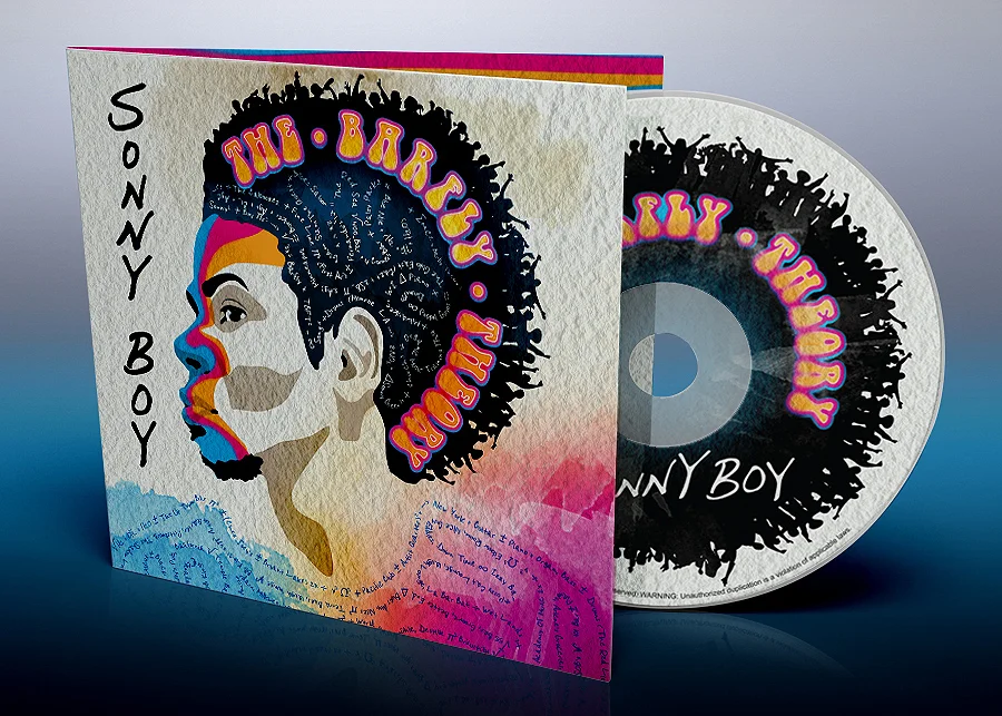
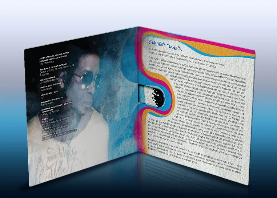
Sonny Boy - The Barfly Theory

5
Just Kidding 2014–2015 Season

3
Walmart E-commerce

3
Audible "Add Your Story"
3
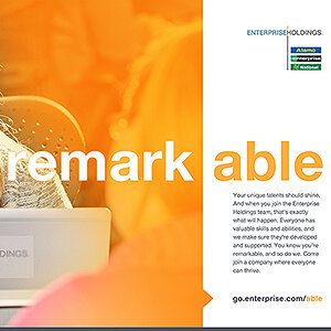
Enterprise Holdings - Diverse Abilities Campaign

4
Audible “Any Other Isn't Audible”

2
Clarity Robotics

7
IBM - Watson Illustrations

4
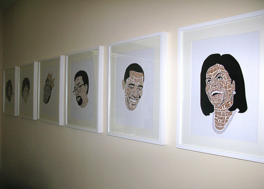
Barack Obama, Ronald Reagan, and the Ghost of Dr. King

6
Junior Kelly - Tough Life

3
Etana - The Strong One
2
i Count
4
Symphony Space 2014–15
5
YisRoyal
5
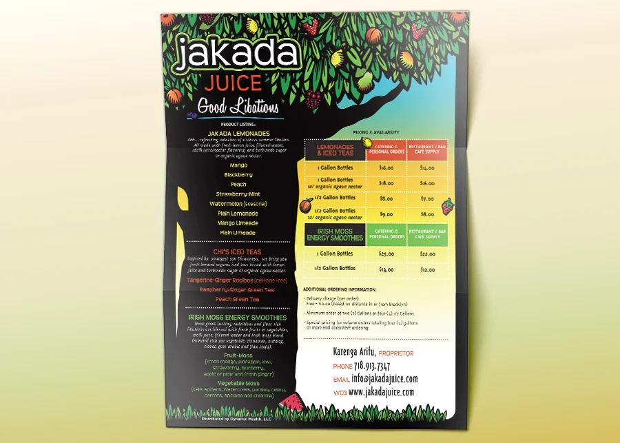
Jakada Juice
4
Safe Circle
4
Kevin Powell

2
Salt-N-Pepa
2
Jamelody - Be Prepared

8
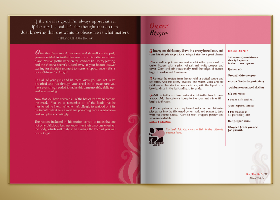
Get ‘Em Girls Cookbook
3
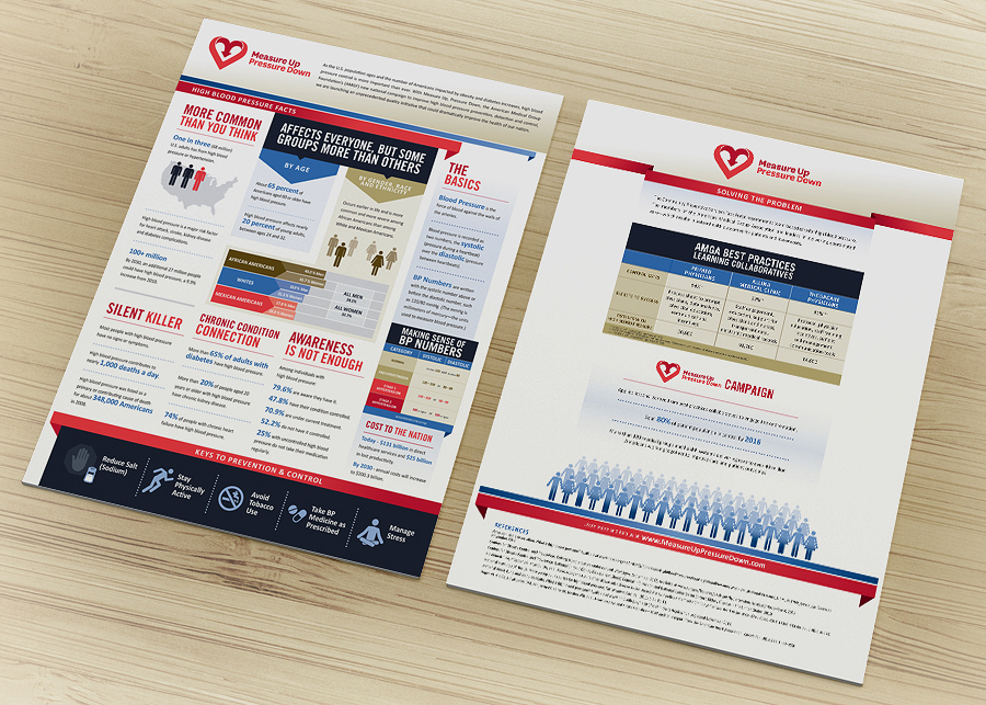
Measure Up / Pressure Down Fact Sheet

4
Avon Foundation for Women

3
NYU-POLY Career Fair 2011

3
National Oceanic and Atmospheric Administration

2
CAI - International AIDS Conference

2
A Talent for Trouble

4
ECHOES of Empowerment Magazine
4
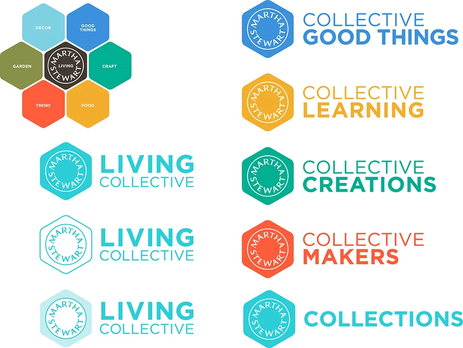
Martha Stewart Living Collective
4
Museum of Modern Art
4
Corning

2
Trapper Keeper